When we moved into our house four years ago everything was just painted and "new" and we did not really feel the need to do anything but get unpacked and start enjoying our cozy new home. We still have not done anything to make the inside of the place look any better than it was that day in October 2003. It's starting to show. Also I was hoping that some of the colours would grow on me. They have not!
Upstairs has the typical bright, primary colours feel.

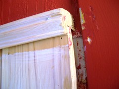
Very red!

Very green!
There is also a blue room and a yellow room, but I don't mind those so much. Office/guest room and main guest room (spinning room, ssshhh).
That green... It's like sleeping inside a cuecumber! What's really starting to get to me though is that I can no longer turn a blind eye to the little details showing how absolutely sloppy some of the work has been done, and the fact that we are also wearing our house down faster than I thought.

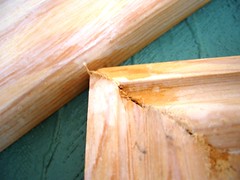
Getting the bedroom painted would also be a good opportunity to get new bedroom curtains. Though that would mean getting rid of the ones P so lovingly hemmed. Look at that job...

He did not even use cissors for the whole operation. That is one gorgeous 1+ meter hem.
(Did you not catch the dripping sarcasm here? Try again!)
What's the point in all this, in a supposed-to-be-knitting blog? Petter does not want to go to look at, decide on or buy paint with me. I think he's afraid of the whole experience being like going to a LYS with me. And I think he might be right. I know I'll spend ages pondering colours, textures, tools and tricks. Wich are things I like and he lothes. But I think it's important that he has a say in it too, we'll both be spending countless hours with the result. That, and the fact that when I said he had to give me one colour he'd consider he said white. He turned the volume on the tv up when I made him understand there is more than one kind of white.
I think I've scared him off by asking too many times "Will this end up looking like a zebra?"
(That's todays knitting content, I squeezed it in)
So now I turn to you, my few but faithful readers to answer this question:
*What colour paint do I pick to go with these tiles?
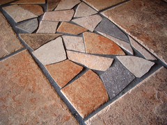
(Hint: I know red does, but I don't like that any longer)
.jpg)
9 comments:
I don't think I can actually help with color suggestions, but I want to make another suggestion. I recently repainted our kitchen (dreadful ox-blood wall paper!) and I knew I wanted yellow and blue. But the yellow and blue I picked out at the store (from the tiny tiny sample square they give you) was *not* the yellow and blue I actually wanted on my walls, once I got it onto the walls. Luckily the wise man at the paint store suggested we take a small sample can, I think 1/2 liter, and paint a patch of wall to test the color. So, I pass this suggestion on to you. Always swatch first! :)
charcoal grey?
taupe? tan? grey? rust?
Could you overpaint the current red with some kind of technique to tone the red down a bit? But don't take my advice, I've rented my whole adult life and grew up with white walls!
How about sage green or slate blue? How about seeing if any of your yarn goes with them and working from there?! I agree with the earlier comment - definitely buy a small sample can to try first. The extent of hubby's involvement can be to look at the sample (once you have one you like) and agree!
I tend to choose light colors for walls, but I am often struck by how "right" deep, saturated colors can look in other people's homes. I am an artist, so I like light, neutral walls that don't compete with the art. To go with those tiles, I might get some samples of a light (but warm) grey. Or a soft beige.
I tend to get influenced by the names of paint colors. I think I chose the color of my kitchen (a pale peachy pink) mostly because it was called Sugar Dusted! Is that not a sweet name? It was also the same color as a cafe I used to work in, and I generally felt happy surrounded by that color.
Pick something that makes you feel happy!
I'd say take a look at your litte mosaic there and you'll get some ideas. You could choose some egg white, cream, isabella, or a light grey.
I just chose a colour called Jotun Lady 0904-Y48R (it goes by two names, 'never' or 'cappuccino') for our former dark red(!) kitchen. We're very happy with it.
I think a pale aquamarine would look lovely with those tiles.....
Taupe or medium grey. Or you could add a bit of taupe or grey to some white paint. Or even a touch of rust!
Post a Comment